Flyers & Maps
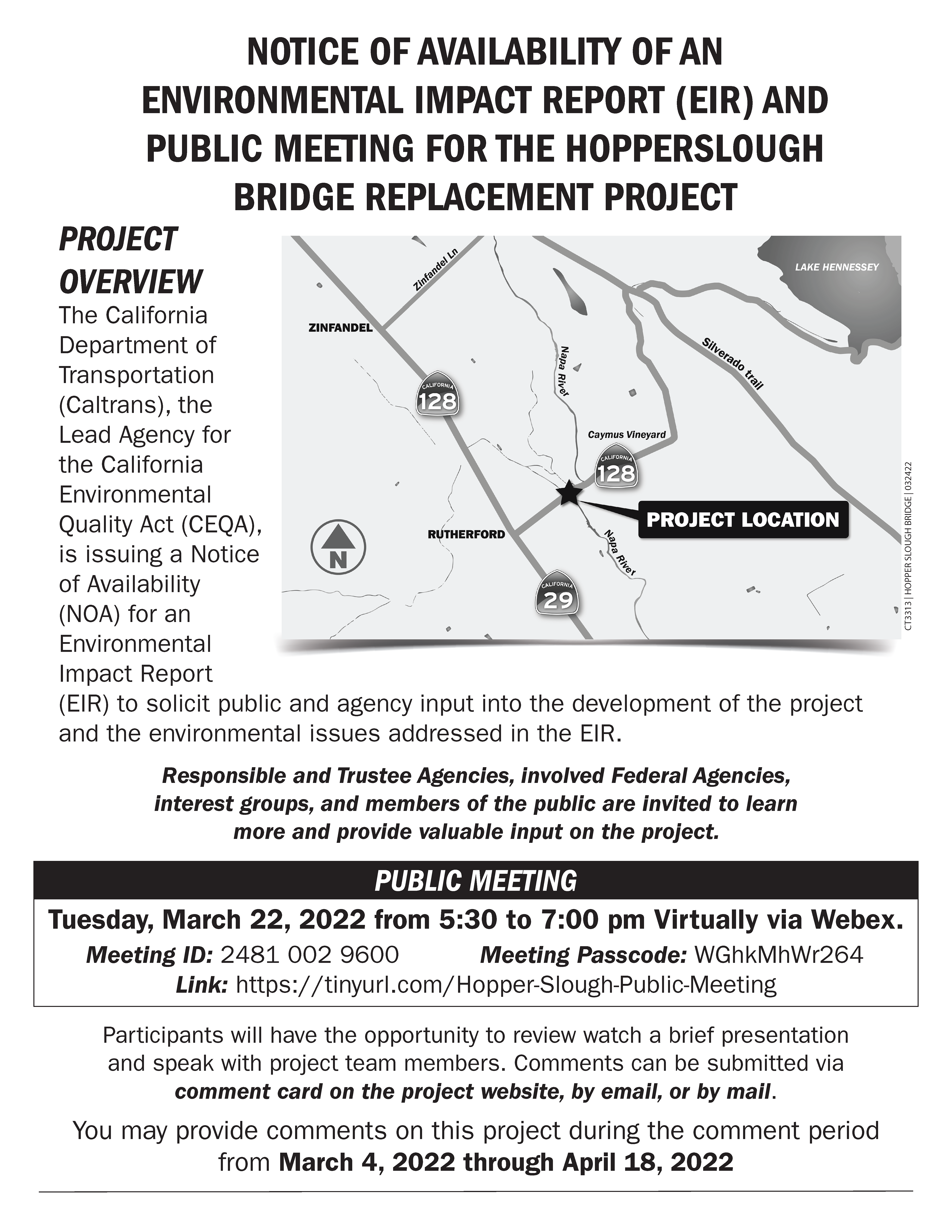
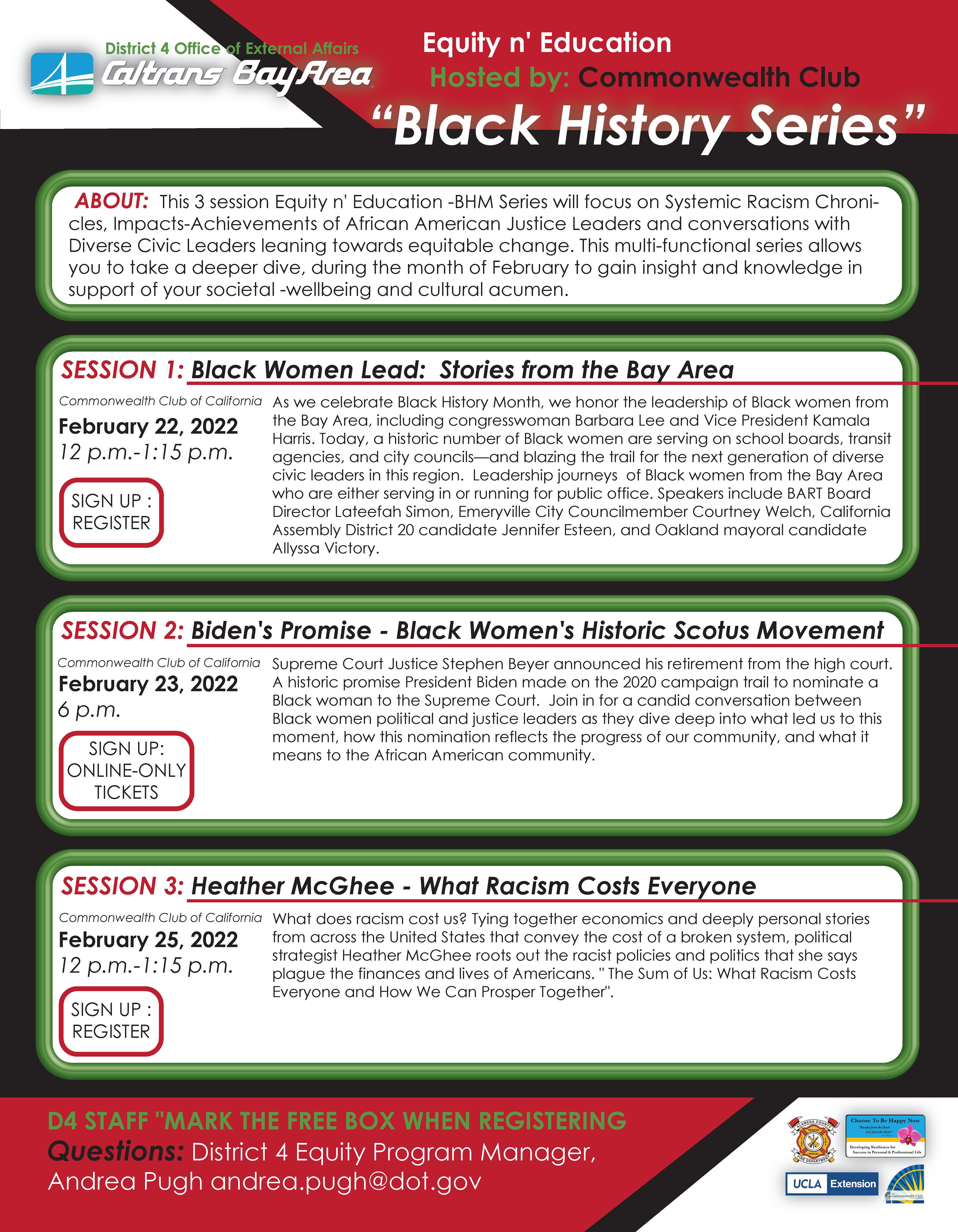
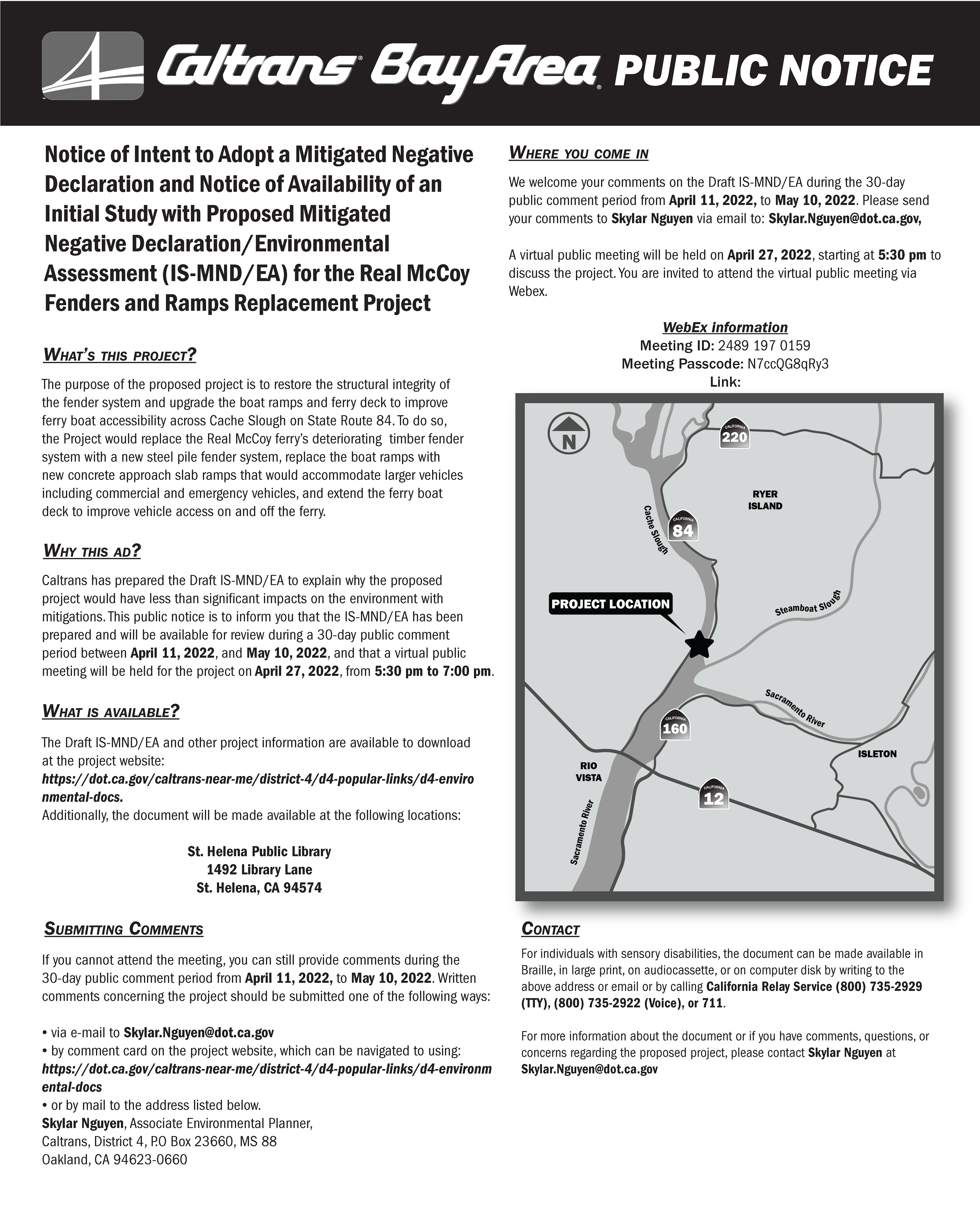
These are a few of the flyers and mailers I created. As you can see, all are very text heavy. Using hierarchy through different text sizes, typefaces and features such as bold or italicized text was very important in making these printed materials legible and understandable to their audience.
Before:
After:
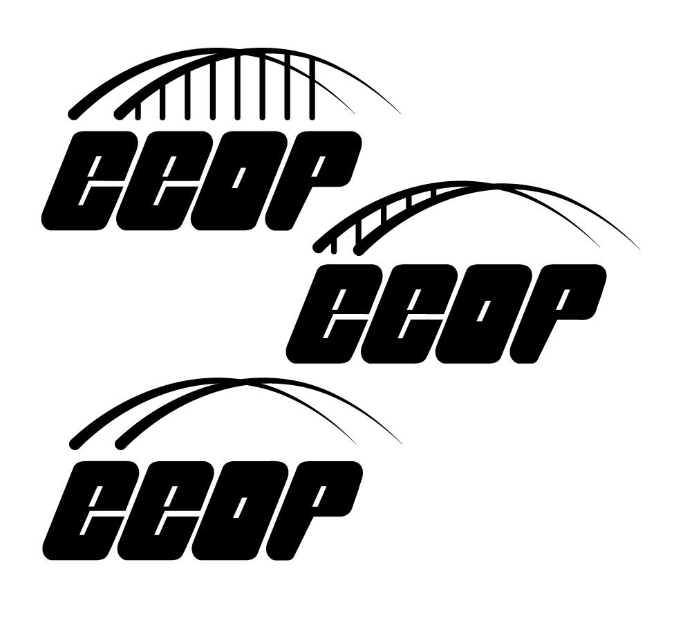
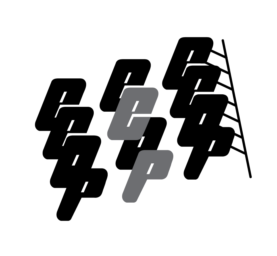
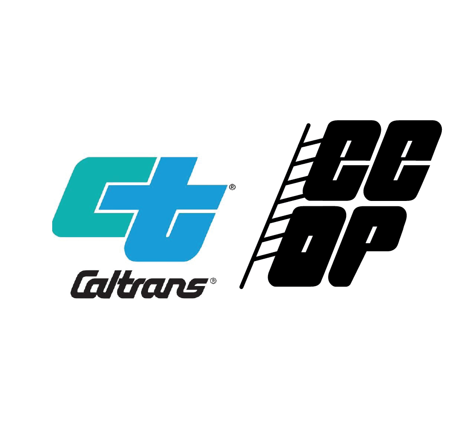
Equal Employment Opportunity Plan Logo
The Equal Employment Opportunity Plan at CalTrans wanted their own logo so my supervisor gave me this assignment. They wanted their logo to look related to CalTrans which is why I used similar bold and blocky letters interlinked. They also wanted ladder or bridge imagery to communicate their mission of providing a bridge to opportunity and raising employees to new heights.
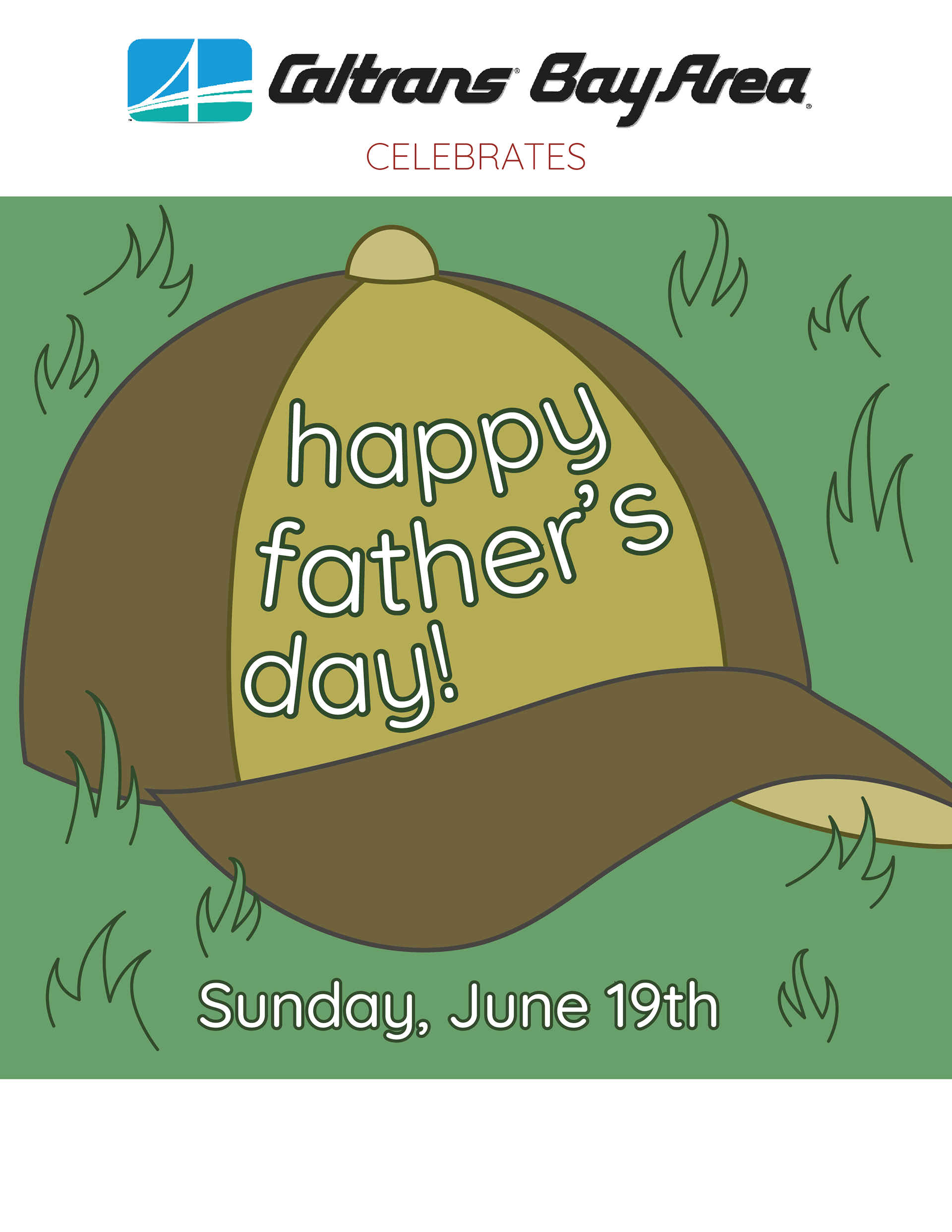
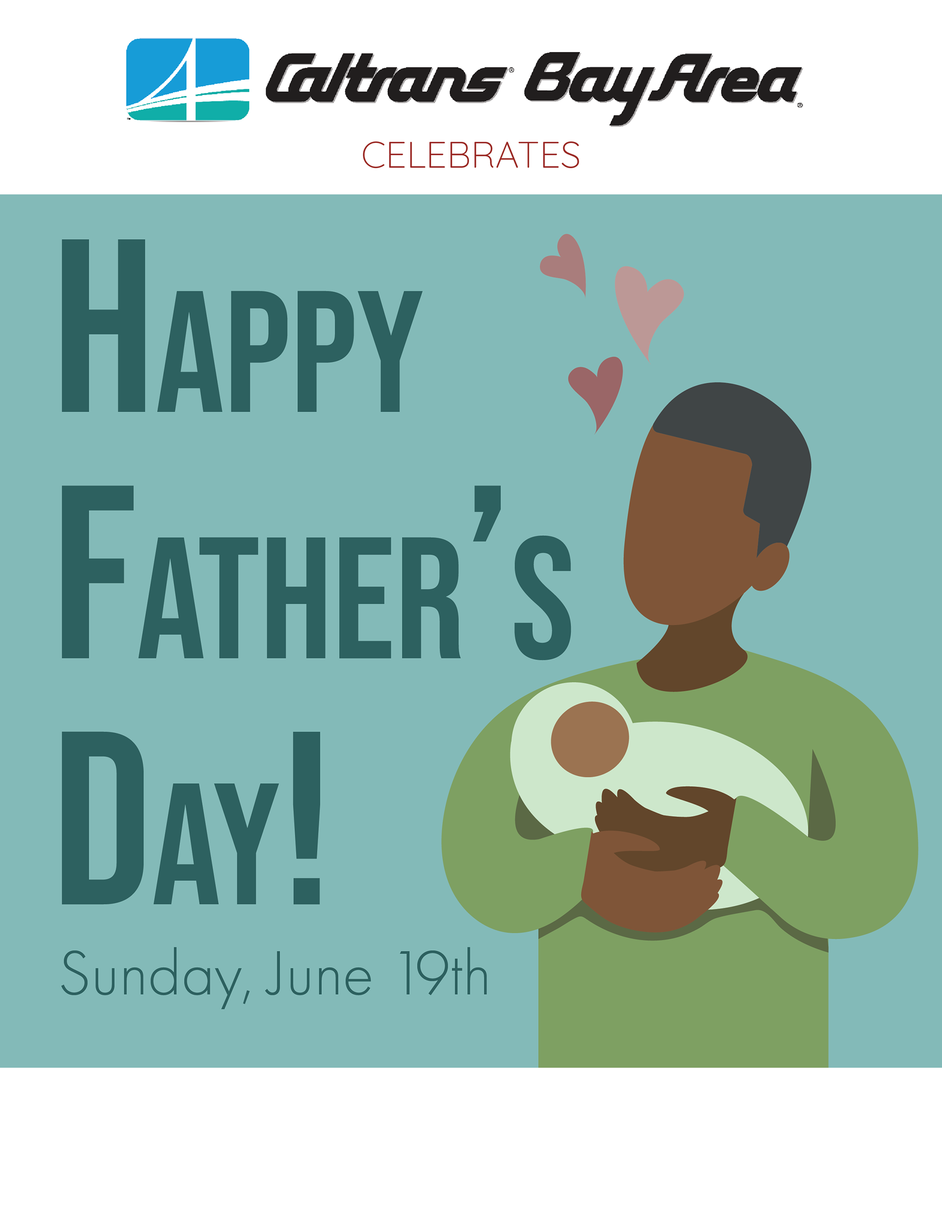
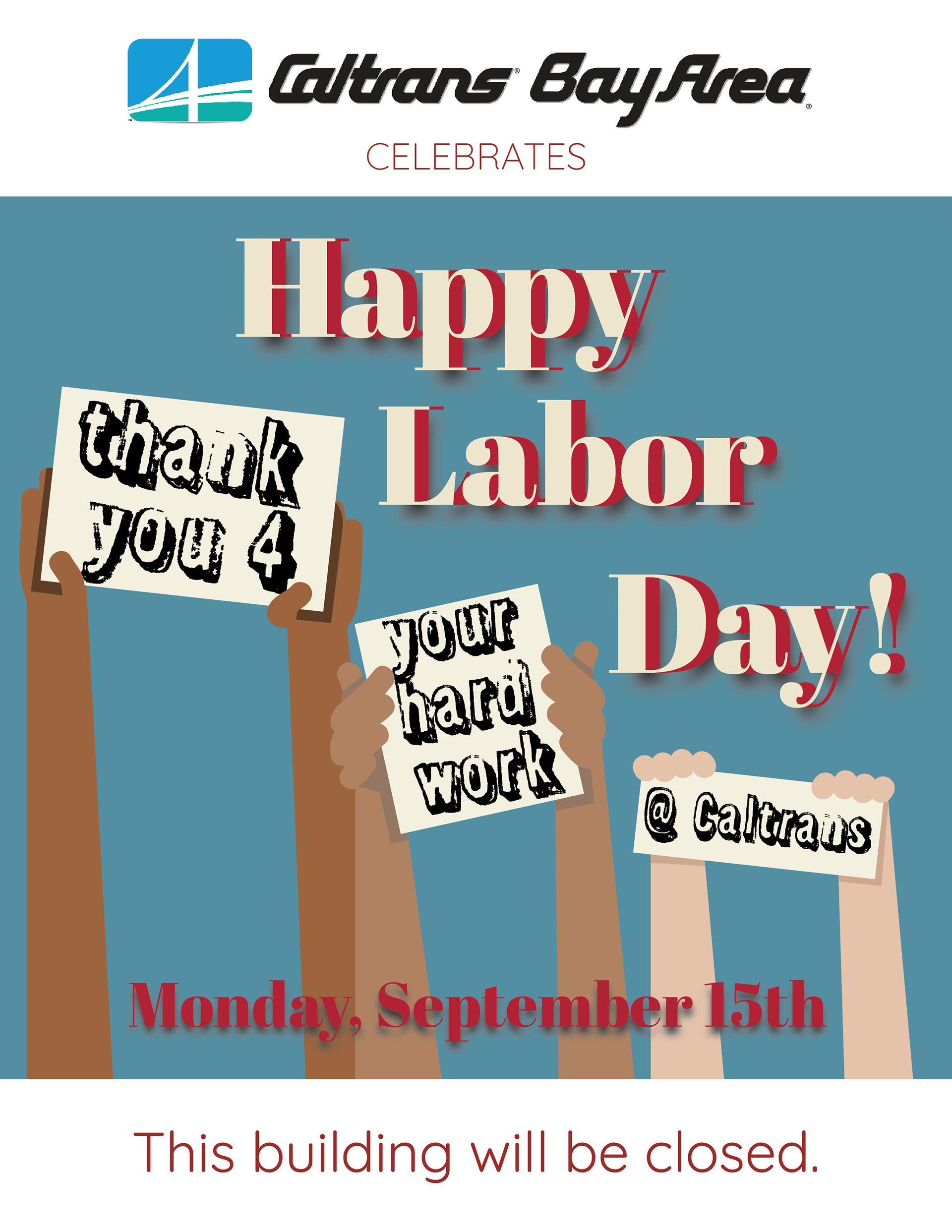
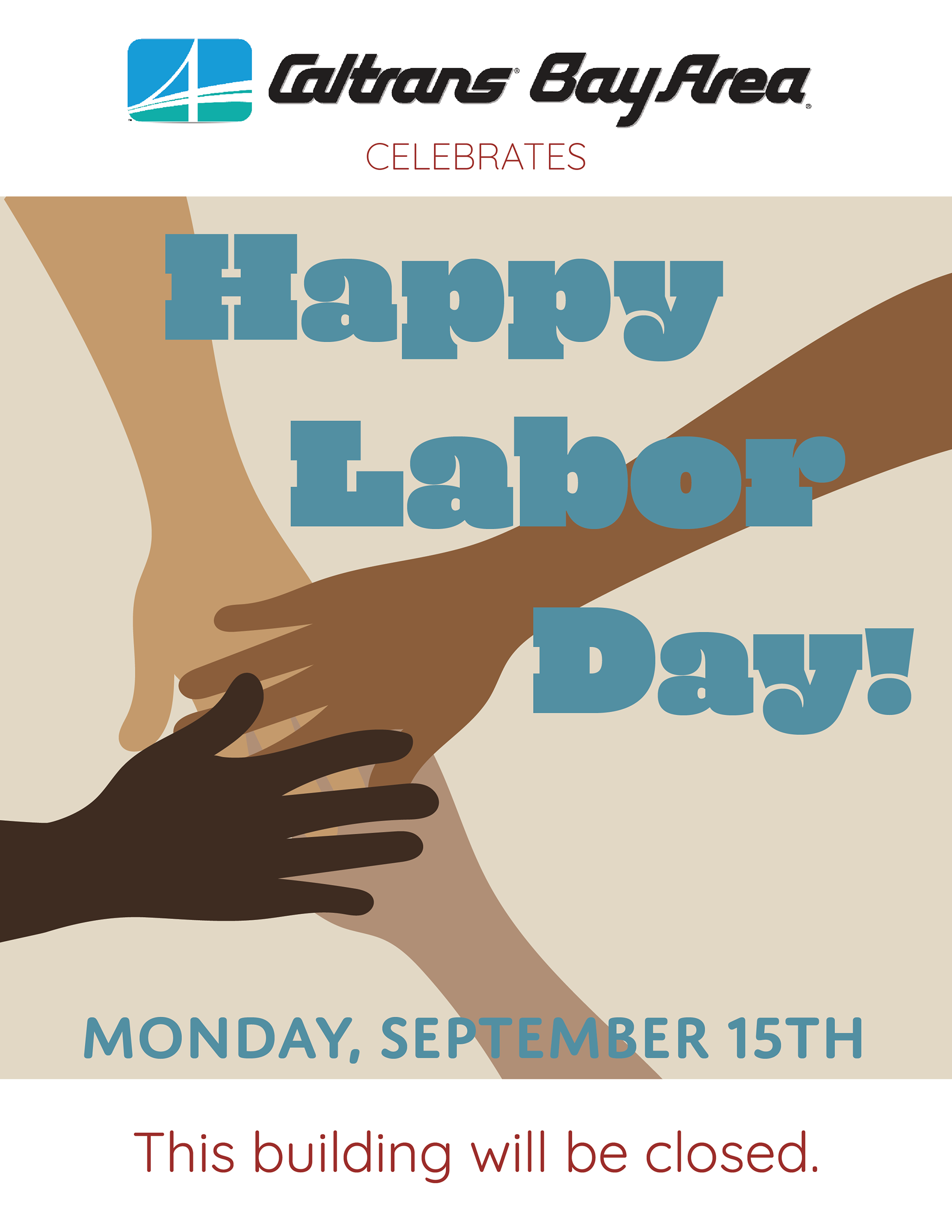
Holiday Posters
